
This week’s entry in the anyone-can-be-a-website-designer category comes to us via Matt, and is an article about reducing website clutter which is part of a design and usability website that itself is surrounded by nearly two dozen advertisements and similar unrelated blocks of content. Honestly, it actually took me a minute or two to figure out that the whole thing wasn’t an enormous spoof, but alas, it’s real and it’s pretty damn sad.
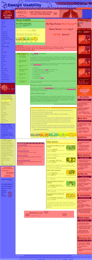
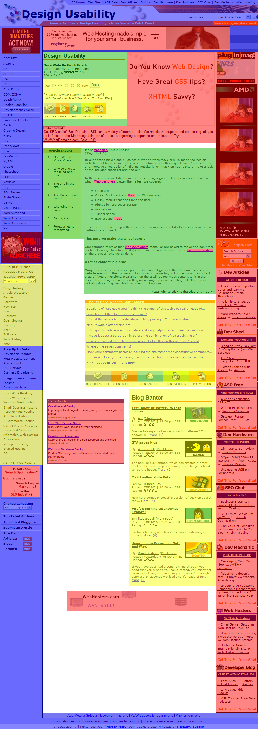
While waiting for some gene expression data to model today, I whipped up a few block-based mockups of the web page. As a legend, the green blocks contain actual content, the blue contain website framing elements, the yellow contain what seems to be useless or misplaced bits of clutter, and the red contains out-and-out advertisements. Here’s a small, purely colorblocked version of the entire webpage, and an image of the actual website with the translucent colorblocks laid over it (there are also full-size versions of each image available). Looking at those, I’m certain that if a set of reviewers didn’t have a color key available, I’m sure they wouldn’t have any idea which color corresponded to actual content. In particular, note the little bits of red within the main green content block, all of which are embedded advertisements that I didn’t even recognize as such until they were pointed out to me earlier today.
To add insult to injury, it now looks like a moderator of the website has started deleting comments pointing out the irony of the situation. (You can see the titles of the deleted comments by viewing the front page of the article and scrolling down to the orange “Discuss More Website Knick Knack” box.) Methinks a better strategy might be to, you know, follow the advice of the article and redesign the godawful site, but what the hell do I know?

http://q.queso.com/archives/001561…
• Pinged by rhapsodic fragments on Dec 15, 2004, 10:49 PM