
Well, MSNBC has now joined the esteemed group of websites with home pages that play audio and video on page load, without any user intervention, one of the more user-hostile things I can imagine a site doing. When added to the awful embedded IntelliTXT ads that are now appearing throughout most MSNBC.com news stories, it seems that the entire site took a major turn to brazen suckery sometime over the past few weeks. That actually makes me sad — I used to use CNN’s website as my default for news but moved to MSNBC when CNN decided on providing most of the news on the website via video snippets that can’t be played on non-PCs. The video-without-my-requesting-it problem was enough to get me to stop using ESPN’s website for all but a scant few things; now it looks like I’ll have to find a replacement for MSNBC, as well.
I’m pretty sure that the main qualification for being appointed head of IT for any of the popular marathons is a complete inability to anticipate people’s desire to use online services to track runners. Take today, for example; in my 50 to 100 attempts to load the NYC Marathon Athlete Tracker over the past hour, I’ve had the page successfully load and render a sum total of five times. Or take last weekend’s Marine Corps Marathon, where the reliability of the athlete information site was a slight bit better, but the system which sends alerts via text messaging was spotty at best (the norm was to get an alert somewhere around 15-20 minutes after a runner passed a waypoint). In my three years of living in Massachusetts, the site for the Boston Marathon always became unusable within 20-30 minutes of the official race start, and last year I didn’t get a single text message update for the people I was tracking.
In today’s day and age, the technology and knowhow certainly exists to build a reliable site capable of handling a short-term heavy load; given that every single popular marathon decimates the IT systems meant for public use, how long will it take for a company like Google or Yahoo to step in and solve this problem?
As part of our move down to DC, Shannon and I both have to change our addresses and phone numbers with what feels like a metric ton of companies and services. I’ve spent the last half hour or so making my way through the four or five domain name registrars with whom I have accounts, and wow how painful each of them makes the process of changing your contact information. First, you have to change your personal information, which seems to be the mailing address and phone number they keep on record for use when your domain names are about to expire (or to pass on to marketing agencies and spammers). Then, you have to find your billing information and change that, so that when the company automatically charges your credit card, they are able to match the information up with the billing address on the card. Finally, you have to go through each and every domain name, updating the addresses and phone numbers on record for the various contacts listed on the domain registrations. And for each registrar, just finding the links to let you get to each of these bits of information is difficult, so it ends up taking five to ten minutes just to get through a single company’s process. Would that any of these companies invested a cent or two in the services of one of the hundreds of website usability consultants out there…
For the true geeks among you, you can now scroll through comments and posts on this site by using keyboard shortcuts — pressing ‘.’ (the period key) scrolls forward, and pressing ‘,’ (the comma key) scrolls backward. Thanks to Sam Ruby for inspiring me (and for the Javascript that I used as the basis for my resultant scripts), and to MetaFilter for being a good testing sandbox.
(For those who are interested, the choice in keys comes from reBlog, the web-based syndication aggregator I use. I’ve gotten so used to scrolling between posts with the period and comma keys that I started to unconsciously use them on other sites; that’s when I knew that I should look into how to set up the shortcuts here at home. Convincing Matt to give ‘em a whirl over at MetaFilter wasn’t too hard… seeing as he was the one that turned me onto reBlog!)
Am I alone in thinking that the user interfaces of the next generation of Microsoft Office applications might be the very textbook definition of overengineered? Looking at them, the Office team appears to have done away with the File menu entirely (perhaps it’s hidden underneath the little floppy disk icon in the upper left?), and moved nearly all functionality into the toolbars, renamed “command tabs” and “ribbons” in the new UIs. What’s more, the ribbons appear to flow out of (and be entirely dependent on) choices made from the few menubar options that remain, making the interfaces even that much more confusing. Hell, in the Outlook screenshot, all the various bits of chrome appear to take up nearly a third of the window — talk about needlessly de-emphasizing the most important part of the interface, the part in which the user actually writes a message!
Years and years ago, Apple was praised to the rafters for its strict guidelines on how a program should present its functionality (known as the Apple Human Interface Guidelines). Over time, the folks in Cupertino began breaking a lot of their own rules in the interfaces of apps like QuickTime and iTunes, but there’s still a good core of consistency in the Mac interface that stretches all the way back to the Lisa in the early 1980s. Looking at these Office screenshots, it’s clear to me how important that consistency is — and how totally and utterly confused a lot of Office 2007 users will be when they’re faced with apps that don’t behave anything like their old ones. I’m not looking forward to that at all.
My favorite broken website of the day: the “Request Credit for a Referral” page of TiVo Rewards.
Back in mid-November, some friends of mine bought a TiVo, and when they activated their service, they put me in as the person who referred them. I got an email from the TiVo Rewards asking if I would like to sign up for an account and get credit for the referral, which I then did. (Irritation #1: despite the fact that I already have an account for my own two TiVos, the company required me to sign up for a separate account because my friends used an email address different than the one I have on file with TiVo. Period, no question, no ability to actually apply those points to the account I’ve had with them for years.)
The referral credit never showed up, so I started doing a little investigation and learned that there’s a way to request credit, but it has to be done within 60 days of my friends activating their service. (Irritation #2: the process requires that I provide the cryptic TiVo Service Number of my friends’ account, meaning that they have to navigate through their TiVo menus to the right place, write down the 15-digit hexadecimal number, and then send that to me.) Today, we were finally able to hook up long enough to get their service number, and I went to the aforementioned page to request the credit… only to find that the field specifying the year of their service activation doesn’t allow you to choose the year 2004. You know — the year that ended less than a week ago, that’s not an option.
Luckily, I was able to call, reach a competent customer service person with less than a ten-minute hold time, and get her to recognize the problem; she spoke to the relevant people and had them apply the credit while I was on the phone. (Irritation #3: the TiVo customer service phone line makes you go through one of those “tell me what you want to do” voice trees, where you have to guess the right phrase that’ll get you on your way.)
What’s the lesson here? Be careful that your customer loyalty programs — like TiVo Rewards — don’t make your customers more irritated with you than they do loyal to you. Having to chase down the credit for my referral, and then being unable to do so through the intended channels, makes me less likely to want to refer people to TiVo again, and thus, ends up having the opposite of its intended effect.
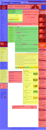
This week’s entry in the anyone-can-be-a-website-designer category comes to us via Matt, and is an article about reducing website clutter which is part of a design and usability website that itself is surrounded by nearly two dozen advertisements and similar unrelated blocks of content. Honestly, it actually took me a minute or two to figure out that the whole thing wasn’t an enormous spoof, but alas, it’s real and it’s pretty damn sad.
While waiting for some gene expression data to model today, I whipped up a few block-based mockups of the web page. As a legend, the green blocks contain actual content, the blue contain website framing elements, the yellow contain what seems to be useless or misplaced bits of clutter, and the red contains out-and-out advertisements. Here’s a small, purely colorblocked version of the entire webpage, and an image of the actual website with the translucent colorblocks laid over it (there are also full-size versions of each image available). Looking at those, I’m certain that if a set of reviewers didn’t have a color key available, I’m sure they wouldn’t have any idea which color corresponded to actual content. In particular, note the little bits of red within the main green content block, all of which are embedded advertisements that I didn’t even recognize as such until they were pointed out to me earlier today.
To add insult to injury, it now looks like a moderator of the website has started deleting comments pointing out the irony of the situation. (You can see the titles of the deleted comments by viewing the front page of the article and scrolling down to the orange “Discuss More Website Knick Knack” box.) Methinks a better strategy might be to, you know, follow the advice of the article and redesign the godawful site, but what the hell do I know?
In an effort to perhaps save people the seven hours I wasted this weekend, I share these two secrets with you:
- the latest drivers for the Linksys 802.11g PC card adapter (WPC54G) do not work with Windows ME, at all, not even a little;
- the setup process for the Linksys Wireless Range Expander (WRE54G) is inane, and relies on a Windows-only application that crashes when you so much as blink at it.
Let’s back up a little bit. Shannon and I went down to New York City this weekend, to watch Alaina (and Dave and Meg!) run the Marathon, and to help my brother and sister-in-law get settled into their new apartment. One of my jobs was to get their wireless network set up, and since they needed to extend the range of the network a little bit, to figure out the best way to do this. While I’m comfortable enough hacking my way around Linksys access points and getting them to serve as repeaters, I figured that I shouldn’t subject them to alternative firmwares and dodgy power boosting, so I read a little bit about the options and settled on the WRE54G as an extender for their Linksys 802.11g access point.
Now, to set up a WRE54G, you have to run a proprietary application on a Windows machine that is connected (wirelessly) to the access point you want to extend. This seemed simple enough, so I powered up one of their laptops, verified that the Linksys PC card could talk to and use the access point, and then ran the setup app. It immediately complained that it couldn’t find the wireless card; oddly, I could then open up Internet Explorer and surf the net with reckless abandon, so I knew that there wasn’t really a problem with the wireless card. As a result, I figured that the issue had to be related to running an older version of the PC card drivers, and headed over to the Linksys website for the latest version. After installing them, though, the computer wouldn’t use the wireless card at all, and kept throwing up weird error messages (some new application, ODHOST, could not stop bitching and moaning). They also wouldn’t uninstall, crashing during the uninstallation process.
I spent a LOT of time trying to debug this, including spending 45 minutes on the phone with two Linksys tech support agents who couldn’t grasp that their uninstaller was crashing. (Them: “But why don’t you just uninstall them?” Me: *whacks head against marble countertop repeatedly*) The agents ended up concluding that there was nothing they could do to help, and that the best they could do was have someone else call me back at a later, unknown date. (*whack whack whack*) I finally tracked down this Broadband Reports thread in which someone else wasn’t ever able to get them working on Windows ME, and a lightbulb went off; I asked my brother if he had held onto the original CD that came with the card, and when he dug it out of a box, I reinstalled the drivers on it and everything went back to working fine. Of course, I was still unable to run the WRE54G setup application, the problem that got everything rolling in the first place.
I decided to try their other laptop, which runs on Windows XP. This time, the setup application ran fine through the first few steps, but when it got to the place where it scanned to see if it could find the WRE54G, it crashed every time and left me without a wireless connection at all. The connection came back when I rebooted, but the crash was reproducible every time. I again decided to give a driver update a chance, and made some progress — after that, the setup application was able to scan all visible wireless networks to try to find the WRE54G, but it claimed that it was unable to find it. I reset the device, to no avail, and then just gave up.
The whole time I was working on the equipment, my brother kept asking how Linksys expects normal customers to be able to set this stuff up. And after my experience, I can honestly say that I haven’t a clue — between their drivers and setup applications being incompatible, their drivers plain not working, and their buggy setup and uninstallation utilities, it’s impossible for even a seasoned network professional to get everything working, much less a casual home user. It’s a shame; Linksys is owned by one of the best networking companies in the world, and I’d expect better of them.
